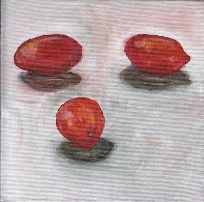
8" x 8" acrylic on canvas panel
This apple gave me fits. I repainted it 3 times, each time trying to simplify more and more. I did end up with something that I am happy with. When I compare it to my first apple, I can see that it is much better. I love the yellow-green and bright pink together.
Saturday, July 25, 2009
Labels:
acrylic,
apple,
daily,
Daily painting,
green,
M. Graham,
painting,
pink,
red-violet,
yellow-green
Friday, July 24, 2009
Cherry Red
I wanted to paint these cherries one last time before they were too shriveled. I love the bright yellow background. The two touching cherries are supposed to draw your eye. It is a composition trick I read about in the book, "The Simple Secret to Better Painting ". It is a great book, and I recommend it to anyone trying to make more interesting paintings.
Tuesday, July 21, 2009
Lemons and Plum
I wanted to paint more loosely here, and to finish the entire painting in one hour. I really like the color combination of red-violet with yellow on a pale lavender background.
Monday, July 20, 2009
Frankoma Plate with Plums
I ordered some new paints and they came today. I love them! They are M. Graham Acrylic colors. They are so much more saturated and true than the paint I have been using. I really was not expecting to see such a difference. They also have a longer "open" time and blend so smoothly. Anyway, I am hoping it will improve the look of my paintings. Here is a Frankoma Plate with some plums.
Friday, July 17, 2009
Frankoma Pottery Sugarbowl
I collect Frankoma Pottery. I really wanted to paint this sugar bowl but I knew it would be challenging because the glaze is multicolored and multi-"tonal". I think I pulled it off. This pattern is called Plainsman and the color is woodland moss. If you would like to see pictures of this pottery for comparison, just do a search on e-bay.
Labels:
acrylic,
blue-green,
Daily painting,
Frankoma,
painting,
pottery,
sugar bowl,
woodland moss
Wednesday, July 15, 2009
Hot Banana
I love the active colors in this one. Mostly warms with just a little touch of blue and green. Again, my goal was to complete it in under one hour. I love painting bananas, I think because they are an easy fruit to get the shape correct. So much easier than a round fruit.
Labels:
acrylic,
banana,
blue,
Daily painting,
fruit,
orange,
Still life,
yellow,
yellow-green
Tuesday, July 14, 2009
Orange Impression
I had two goals with this painting, 1. To finish from set up to final brush stroke in one hour, 2. To make a much looser painting. I did accomplish those goals. My favorite part of this painting is the color combination of the teals and oranges. The hardest part about this painting is that the red and yellow paint is extremely transparent, and I had to keep going back over to cover the canvas.
Labels:
acrylic,
blue,
daily,
Daily painting,
orange,
Still life,
teal
Sunday, July 12, 2009
Cherry Bomb
More cherries, more purple. The next time I paint transparent glass, I am really going to work on simplifying the shapes that I see to create the illusion of transparency. I repainted this glass several times and each time I left out more detail. TRADED -for a bottle of Cachaca from our visiting friend from Brazil. A pretty good trade I would say.
Saturday, July 11, 2009
Mug O' Mum
I painted this purple mug on a purple background with a mum peeking out the top on Thursday of the Carol Marine workshop. I just love these two colors together. The hardest part about this painting was getting the shape of the mug right.
Labels:
acrylic,
Daily painting,
mug,
mum,
painting,
purple,
violet,
yellow green
Friday, July 10, 2009
Punch Cup with Cherries
In this painting, I focused on the composition. I think the handle of the cup came out particularly well. I also love the shade of green in the background. It reminds of those antique green mixing bowls. I did this painting on Wednesday of the Carol Marine workshop at the Coppini Academy. It was so nice to be able to ask for help from such an accomplished painter.
Thursday, July 9, 2009
Tea for Three
Another painting I did on the second day of the Carol Marine workshop. In this painting we could choose our subject. This is the same teapot I have painted before, and I think it is much better than the last time I painted it. I love the acid green and pastel teal of the background.
Labels:
acrylic,
blue,
cherries,
Daily painting,
painting,
teal,
teapot,
yellow-green
Wednesday, July 8, 2009
Carol Marine Workshop Day 2
Day two of our workshop, Carol gave us an assignment in painting values. The parameters were to use one color ( I used burnt umber) to create three paintings, each with a different value being dominant. The paintings were timed. The first painting was done in 30 minutes, the second in 15, and the third in 5! The idea is to try to simplify the painting enough to capture the essence of the object using value. My first painting of the mug is light-value dominant, the second painting of the pitcher is mid-value dominant, and the third painting of the egg cup is dark-value dominant. This worthwhile exercise was challenging and fun!
5" x 7" acrylic on canvas board, 15 minute painting time
Labels:
acrylic,
burnt umber,
cup,
Daily painting,
egg cup,
mug,
painting,
pitcher,
values
Carol Marine Workshop, Day 1
I have been having so much fun this week taking the Carol Marine workshop at the Coppini Academy of Fine Arts in San Antonio. Carol is of course wonderfully talented, disciplined, and an excellent teacher. The first day I painted these bell peppers. I like the color scheme of red-orange and teal blue, and the reflected blue light.
Labels:
acrylic,
bell pepper,
Daily painting,
painting,
pepper,
red-orange,
teal
Friday, February 20, 2009
Three Bananas
I really had fun with the colors on this one. Purple is my favorite, and I think I really got the essence of the bananas this time. It is much more simplified than my last banana painting. I am going to continue to play with the colors a bit more. What do you think? Acrylic on 10" x 10" canvas
Wednesday, February 18, 2009
Sick Days-Thermometer and pills
Everyone around here has been sick for days. Here is a small still life. I really had an "a-ha" moment on this one. Simplify! 5.5" x 8.5" watercolor on 140lb. paper.
Labels:
blue,
blue pills,
daily,
Daily painting,
painting,
pill,
sick days,
Still life,
thermometer,
watercolor
Tuesday, February 17, 2009
Apples,Three and Two, Watercolor and Acrylic
First I did the watercolor of three to loosen me up. It looks quite pretty, I think. Then, I did the two apples in acrylic in some of my favorite shades of lime, teal, jade, kelly, sap, and sea. I love how the pair are almost touching, creating a little bit of tension. The two is acrylic on canvas board, 5"x 7", and the three is watercolor, 9" x 12" on 140 lb. watercolor paper.
Monday, February 16, 2009
Saturday, February 14, 2009
Thursday, February 12, 2009
Today's Painting, Starbucks Mug #2
I tried painting this mug the other day and got really frustrated. Then, I did the watercolor sketch of it (see previous post) and tried again today. I think the watercolor really helped loosen me up. I am much happier with this. Hope you like it too. Acrylic on canvas board, 7" x 9".
Labels:
acrylic,
coffee,
Daily painting,
green,
mug,
painting,
starbucks,
Still life
Candy hearts 2/12/2009
Labels:
candy,
candy hearts,
daily,
Daily painting,
green,
orange,
pink,
watercolor,
yellow
Watercolors cont. 2/11/2009
I think one of the hardest things to paint are flowers. Since the petals are so delicate, they can look "clunky" when rendered in paint. I really like watercolor for floral paintings. Here is a pretty pink rose, hope you like it. Watercolor on 140lb. paper, 8.5" x 5.5"
Labels:
daily,
Daily painting,
flower,
pink,
rose,
watercolor
Watercolors 2/11/2009
I decided to do a few quick watercolor sketches today because I was feeling stuck, and I like the spontaneous feeling of a watercolor. It forces me to be more loose. When I paint, I am getting bogged down in the details. I realize I need to SIMPLIFY and edit everything I am seeing. Watercolor on 140lb. paper, 8.5" x 5.5"
Labels:
coffee,
daily,
Daily painting,
mug,
starbucks,
watercolor
Monday, February 9, 2009
2/9/2009 Orange
This was a challenge. I realized I really only needed to show the texture around the highlight to make it seem to be an orange.
Saturday, February 7, 2009
Thursday, February 5, 2009
2/2/2009 Apple
Subscribe to:
Posts (Atom)